Create Your First Project
Start adding your projects to your portfolio. Click on "Manage Projects" to get started
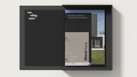
Blackhaus
Project Type
Naming, Visual Identity
The color black is the color of the bold, of eternal elegance, of refined rebellion, of timeless style.
This was the starting point that guided us in the construction of the new identity of the former NI3. The brand already delivered excellence in service, but it still had an aesthetic that did not reflect this delivery. It lacked soul. It lacked intention.
We explored languages, origins, symbols. Along the way, the “3” that previously referred to the triad and balance evolved into the “B”, which today anchors the new logo: simple, strong, memorable.
The name BlackHaus emerged as a natural development of this construction. With an international sound and a foothold already positioned in the North American market, it expands the brand's horizon not only in terms of territory, but also in terms of ambition.


